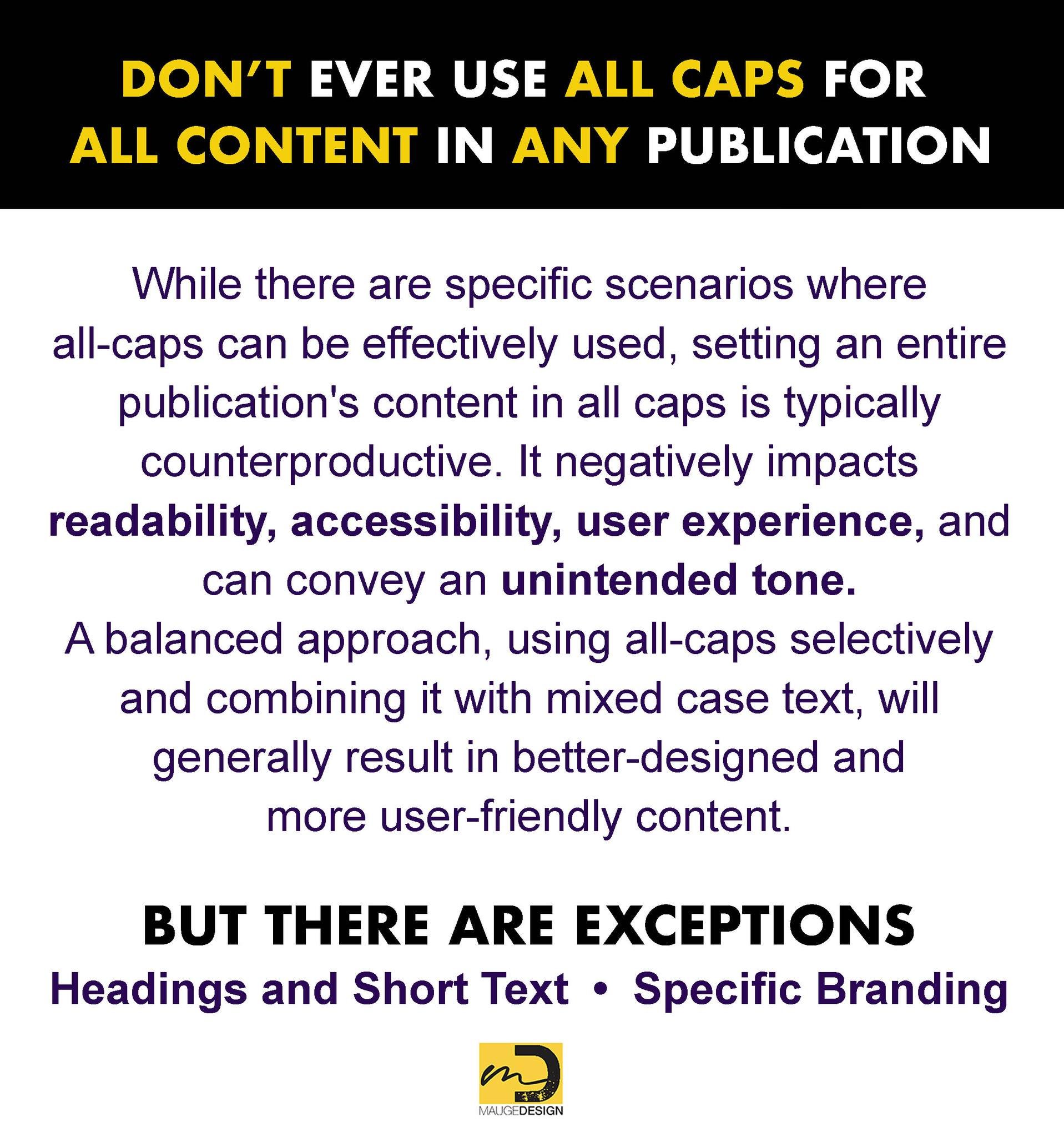
The use of All caps. When to use words written only in capital letters
Content set in uppercase and lowercase is easier to read than content set in all caps due to several key factors related to how we recognize and process written text. It is generally preferred for readability and effective communication. When text is set in uppercase and lowercase, each word forms a unique shape due to the variation in letter heights (ascenders and descenders). This distinctive word shape aids in faster recognition, comprehension, reading speed, and eye movement. In contrast, all caps text creates uniform, block-like shapes, making it harder for the brain to distinguish between words quickly, and contributing to eye fatigue. This difference in formatting styles significantly impacts the way readers interact with written content and absorb information.
When to use ALL CAPS:
EMPHASIS: Use ALL CAPS to provide emphasis or to make certain words stand out in a sentence. However, use this sparingly to avoid overwhelming the reader.
HEADINGS: When creating headings or titles, using ALL CAPS can grab the reader's attention and make it easy to differentiate sections.
ACRONYMS: Acronyms are typically written in ALL CAPS to distinguish them from regular words and make them easily recognizable.
LEGAL DOCUMENTS: In legal documents, important terms or sections are often written in ALL CAPS to ensure clarity and draw attention to critical information.
Remember
Excessive use of ALL CAPS can make text harder to read, so use them thoughtfully and strategically in your designs.


